After college, one of the most challenging experiences young graduates face is finding their first professional job. Many industries are highly competitive with thousands of individuals all searching for similar jobs. Hiring managers meanwhile find it difficult to find their perfect candidate, with costly and time-consuming processes.
EliteGrad set out to change this and create a better way to connect students and companies. They focused specifically on the financial services industry where there is intense competition in sectors ranging from hedge funds, venture capital, to fintech and investment banking.
To stand out in the crowded recruitment market EliteGrad needed to both build an effective and highly usable digital platform, as well as focus on having a distinctive brand.
EliteGrad and Qubika’s partnership
Together with EliteGrad we set out to create a platform, for both the web and mobile, that was easy to use and had an intuitive user experience for students and hiring managers.
On the technical side, we created the platforms and features using languages and tools including React, TypeScript, GraphQL, Node, Hasura, and Auth0.
In addition to the technical focus on developing the platform, Qubika’s Design Studio helped EliteGrad in creating a unique brand, while simultaneously creating a beautiful and intuitive experience for the applications.
How we created a unique brand
We wanted to create a brand that would be a driving force in taking EliteGrad’s business forward. We started by creating brand guidelines to make use of the identity elements that EliteGrad already had, while also incorporating new custom icon designs and illustrations.
During this process, we realized that it was the shield shape of the logo that stood out the most. Our objective was to make EliteGrad distinct, with clear competitive differentiation, when creating the perfect logo.
The challenge of red as the main color
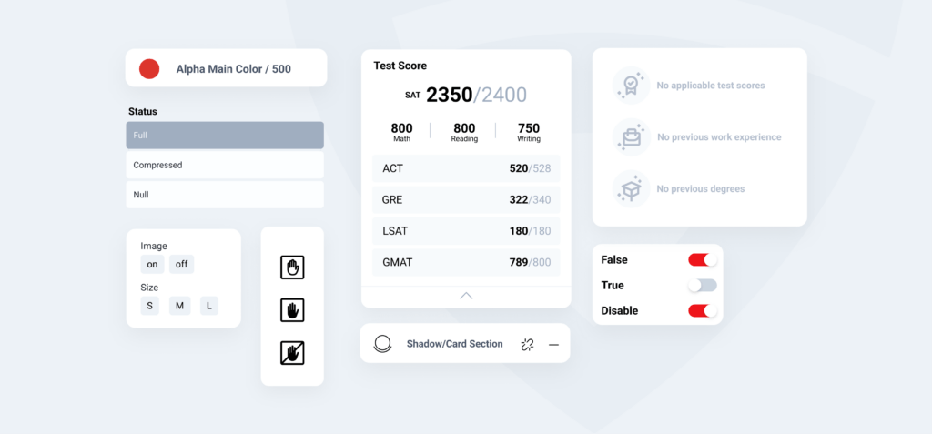
Oftentimes, red is a challenging color to use, especially in the realm of UI. In order to combat this issue, our designers inverted the red-gray ratio in the designs, with the purpose of making the red stand out in some of the most prominent places.
The importance of creating a consistent design system
Design systems are the point of convergence between the design team and the development team. We believe in the benefits of building powerful design systems as an essential tool for more efficient iterations within a project.
Designing for two targets
EliteGrad has two different audiences– students and hiring managers. The platform had to be as intuitive and useful for the recruiter, as attractive and practical for the student.
The different components of EliteGrad’s design
Data visualization
By using different visual elements such as infographics, we provided an accessible way for users to visualize and understand student information. This means hiring managers can clearly access and identify the information they are looking for.
The role of empty states
We knew that not every student that signs up would complete their profile. That’s why it’s crucial for the application to successfully onboard and engage people during their first interactions. We designed the platform to encourage individuals to complete their pending information, and so guarantee an attractive profile for hiring managers to see.
The hiring managers’ platform
Hiring managers need to be able to easily create, edit or delete different jobs, events, and company information. But most importantly, they need a filtering system that saves them time in the hiring and recruiting process.
We created a dashboard to simultaneously visualize various student cards with the most relevant information, so the recruiter has all the information they need in one place. Once they find the candidates they are interested in, hiring managers can contact students directly from the platform via text message or email.
The students’ platform
We created dashboards for students to view jobs, events, and companies, as well as the option to view and edit their own profile whenever they need.
Meanwhile, by designing a more intuitive and more engaging sign up process, we could guide students through a welcoming path that encourages them to complete their profiles.

Bringing it all together: The EliteGrad website
We wanted EliteGrad’s website to be a virtual meeting point between the brand and individuals using their service. In many cases, it will be the first interaction someone has with EliteGrad. So we designed it to show all the services they have to offer. It has separate landings for different services, and there’s a clear difference between the student and employer features.
Going forward: Bringing together students and hiring managers
Recruitment processes have been ripe for disruption for a long time. By using a blend of design best practices and digital technologies, EliteGrad and Qubika are doing exactly this. This powerful combination is both providing new opportunities for young people looking to start their careers, while also improving and streamlining traditional recruitment practices.

