About us
With 20 years of experience, our expertise spans the AI lifecycle - from data engineering and AI agent development to cloud integrations and human-centric product design.
Learn more
Qubika at Databricks Data + AI Summit
Join us June 9-12 to see our leading Databricks capabilities
Our Studios
Our Studio delivery model enables us to address challenges head-on by bringing technology and domain experts together. This ensures we deliver immediate business value with our customized solutions.
Learn moreQubika Studios
Product Design
UX research, service design, design thinking, and UI design.
Artificial Intelligence
Agentic AI, GenAI, machine learning, NLP, computer vision.
Data
Data manipulation, engineering, visualization, and prediction.
App Solutions
Native or hybrid, SDK development, integrations, app store positioning.
Cloud, SRE, & DevOps
Cloud migration, CI/CD pipeline development, SRE, infrastructure-as-code.
Cybersecurity
Secure SDLC, AI-powered cybersecurity, vCISO, penetration testing, AI security assessments.
Platform Engineering
Robust infrastructures, scalable APIs, efficient deployment.
Quality Assurance
AI-augmented QA, test automation, CI/CD, load and performance testing, data testing.
Embedded Engineering
Development for semiconductors, embedded systems, IoT, & microcontrollers.
Product Management
Product consulting, process management, monetization.
Blockchain
Smart contracts, decentralized apps, blockchain integration.
Industries
Qubika partners with leading organizations across industries, delivering technology solutions that drive transformation and measurable results. Our expertise empowers clients to achieve business goals through tailored digital strategies.
Our Industries
Banking
Modernize banking systems for a secure, compliant, AI-ready enterprise ecosystem.
Financial Services
Secure, data and AI-driven financial services - from paytech and financial infrastructure to risk, compliance and analytics.
Health & Wellbeing
People-centric healthcare solutions, from virtual care to integrations and smart devices.
Insurance
AI-powered insurance solutions - from accelerating policy lifecycle management to accelerating claims processing.
Media & Entertainment
AI-native solutions to deliver personalized, real-time, and immersive experiences at scale.
Hi-Tech & Semiconductors
Semiconductor design, firmware, and IoT development, AI-powered embedded systems.
Industry Insights
Impact Studies
Explore in-depth case studies showcasing how Qubika empowers organizations to lead, innovate, and transform their industries. Your journey begins here.
Learn moreAvant
Explore how Qubika and Avant are building a new generation of data and AI-driven financial services for their 3 million+ customers.
OnePay
Qubika is a transformational partner to Walmart's fintech, ONE, creating an all-in-one financial experience for its 1 million+ customers.
Shopify
Qubika worked with one of the largest multinational e-commerce companies, Shopify, to transform the digital merchant and retail experience.
MyRow
Explore how Qubika applied its AccelerateAI framework with MyRow to harness AI-driven development and significantly improve speed-to-value.
Tabula Rasa
Tabula Rasa leveraged agile product management to revolutionize drug traceability, streamline processes, and achieve a rapid market launch.
YouScience
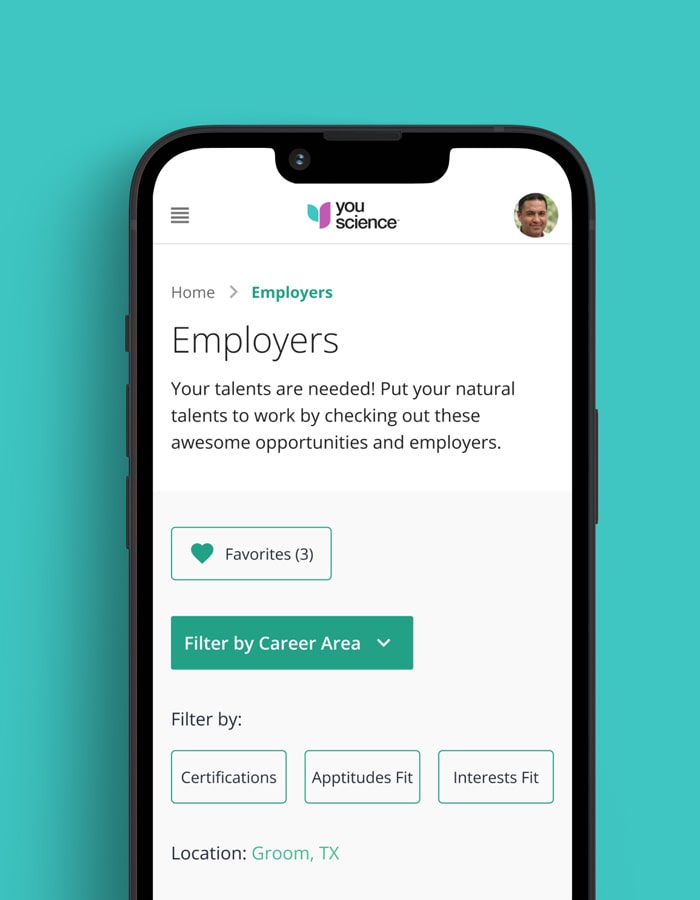
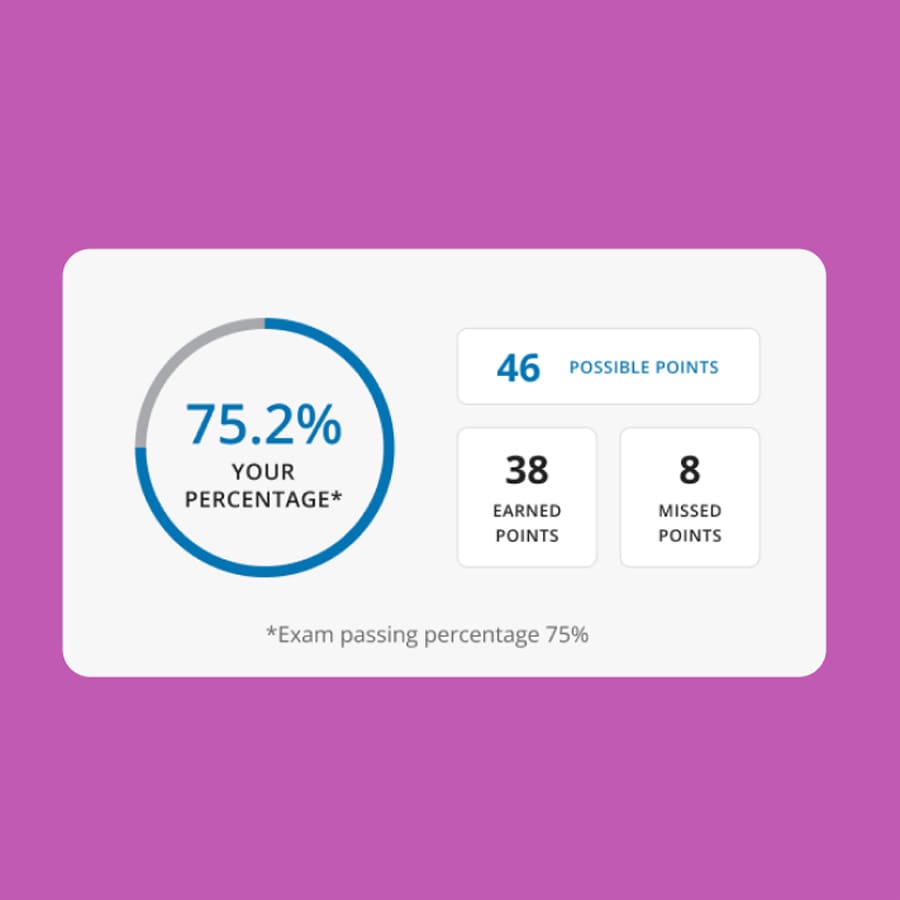
The Qubika Data Studio used machine learning to create hyper-personalized career paths for students on the YouScience edtech platform.
Computer Vision
Qubika is a leading provider of computer vision solutions. These case studies show how we're using AI to build innovative products that are transforming lives.
Wearables
Qubika is at the forefront of the wearable revolution. See a selection of our case studies.
Insights
Dive into our expert insights on the latest in technology and business developments.
Learn moreKey Categories
More Insights
Highlighted Posts
Latest Posts
Partners

About us
With 20 years of experience, our expertise spans the AI lifecycle - from data engineering and AI agent development to cloud integrations and human-centric product design.
Learn more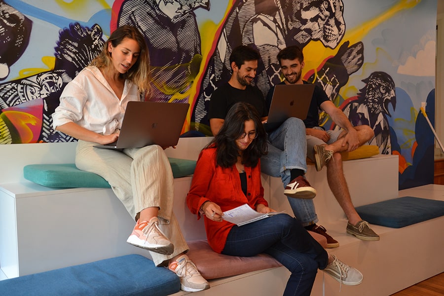
Careers
Are you interested in shaping the AI-future? Then discover how you can join one of the fastest growing companies in the industry.
Learn more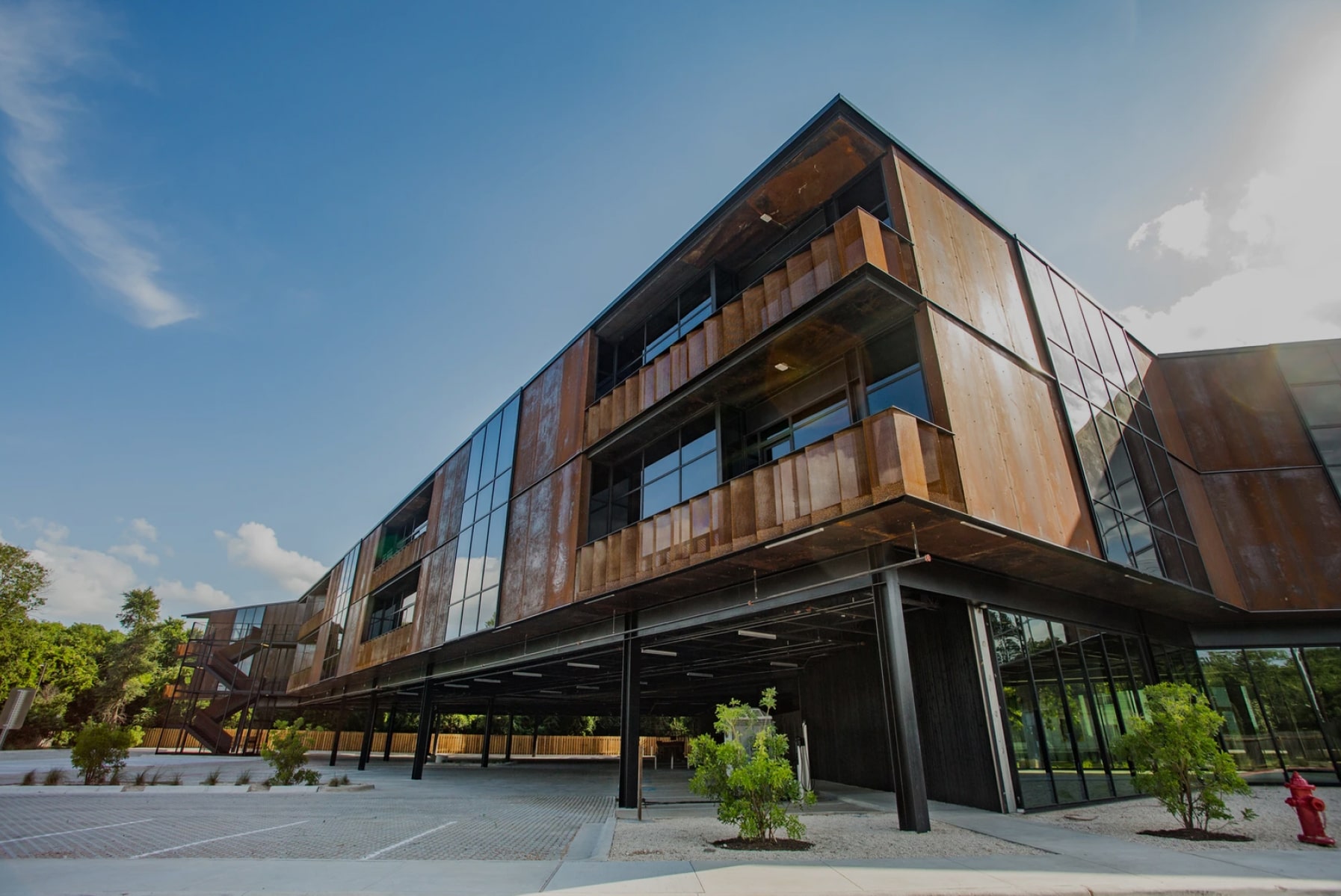
Locations
Qubika's locations are centers of high-quality innovation. Explore our global network and get in touch with our experts.
Learn moreDatabricks Solutions
We've empowered numerous industry leaders to harness the full potential of Databricks' Intelligence platform, driving transformative results and measurable business impact.
Highlights of our partnership
Gold Tier Partner
Qubika is a Gold Tier Databricks partner, delivering scalable, secure data and AI solutions on Databricks.
200+ certified Databricks engineers
Qubika has 200+ certified engineers on the Databricks Intelligence Platform
20+ years of data experience
Qubika has been providing end-to-end data services for over 20 years.
Databricks Insights
Case Study
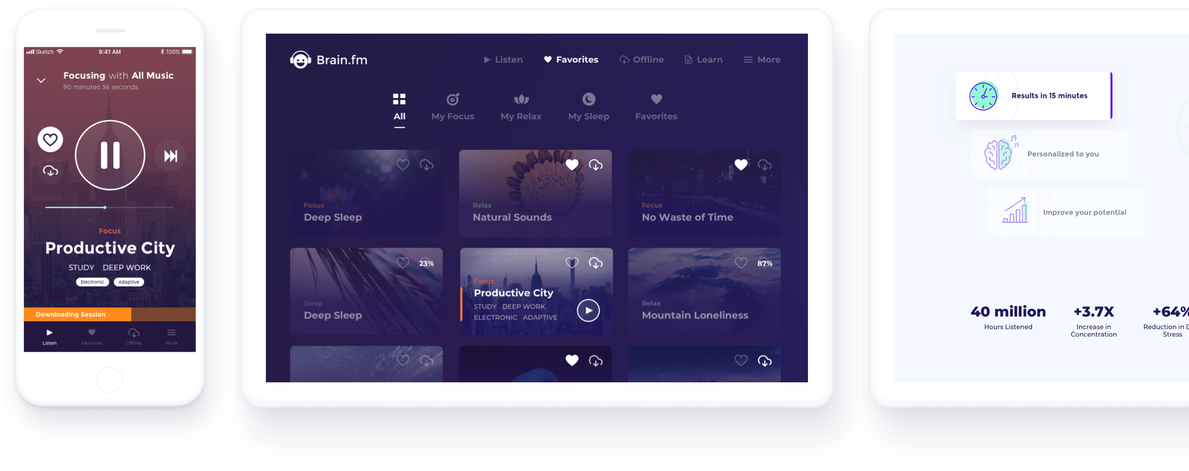
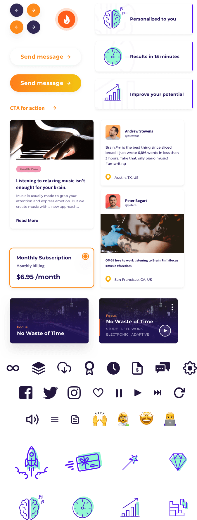
Brain.fm offers focus, relaxation & sleep support through AI-composed music, offering unique acoustic features that are designed to have effects on neurophysiology.

Qubika was approached to help Brain.fm drive the look & feel of its brand towards a more personalized and communicative approach. From logo enhancements, a new color palette and brand book, brand collateral and marketing materials, a complete UX/UI makeover of Brain.fm’s website, mobile & web app to building Brain.fm’s MacOS desktop app, we took the lead on new concepts aimed at an intuitive enhanced user-experience.
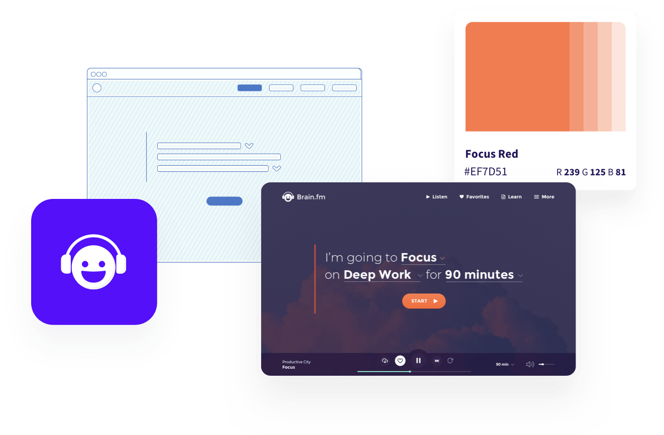

When it came to our first challenge of refining Brain.fm’s personality, we opted for applying color psychology. To mirror Brain.fm’s features and offering we transformed the way the brand visually communicated with its user base towards a more transparent and approachable look & feel.

We then applied our updated branding to the entire Brain.fm eco-system, prioritizing straight-forward user experience and innovative brand-user communication through the concept of natural language.

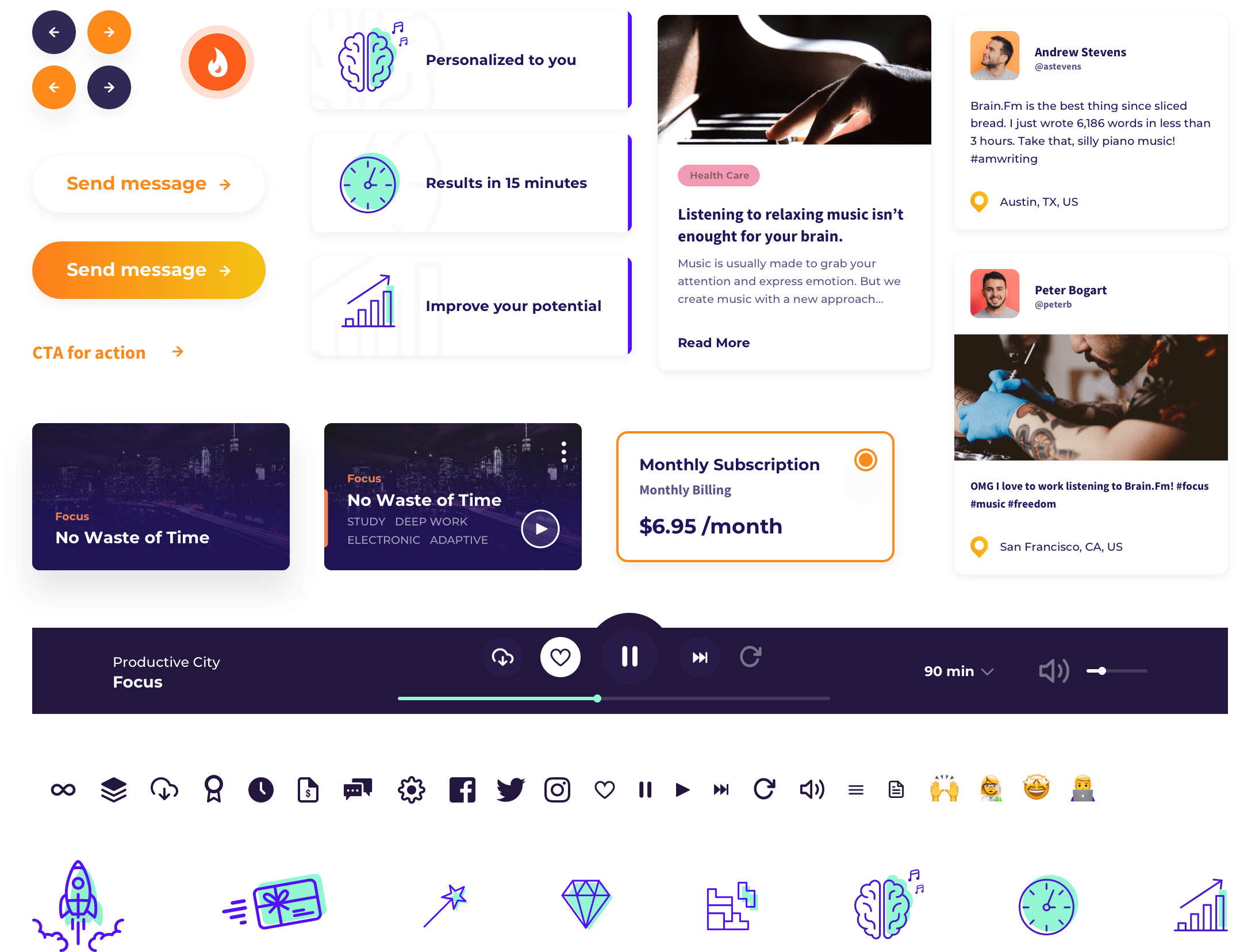
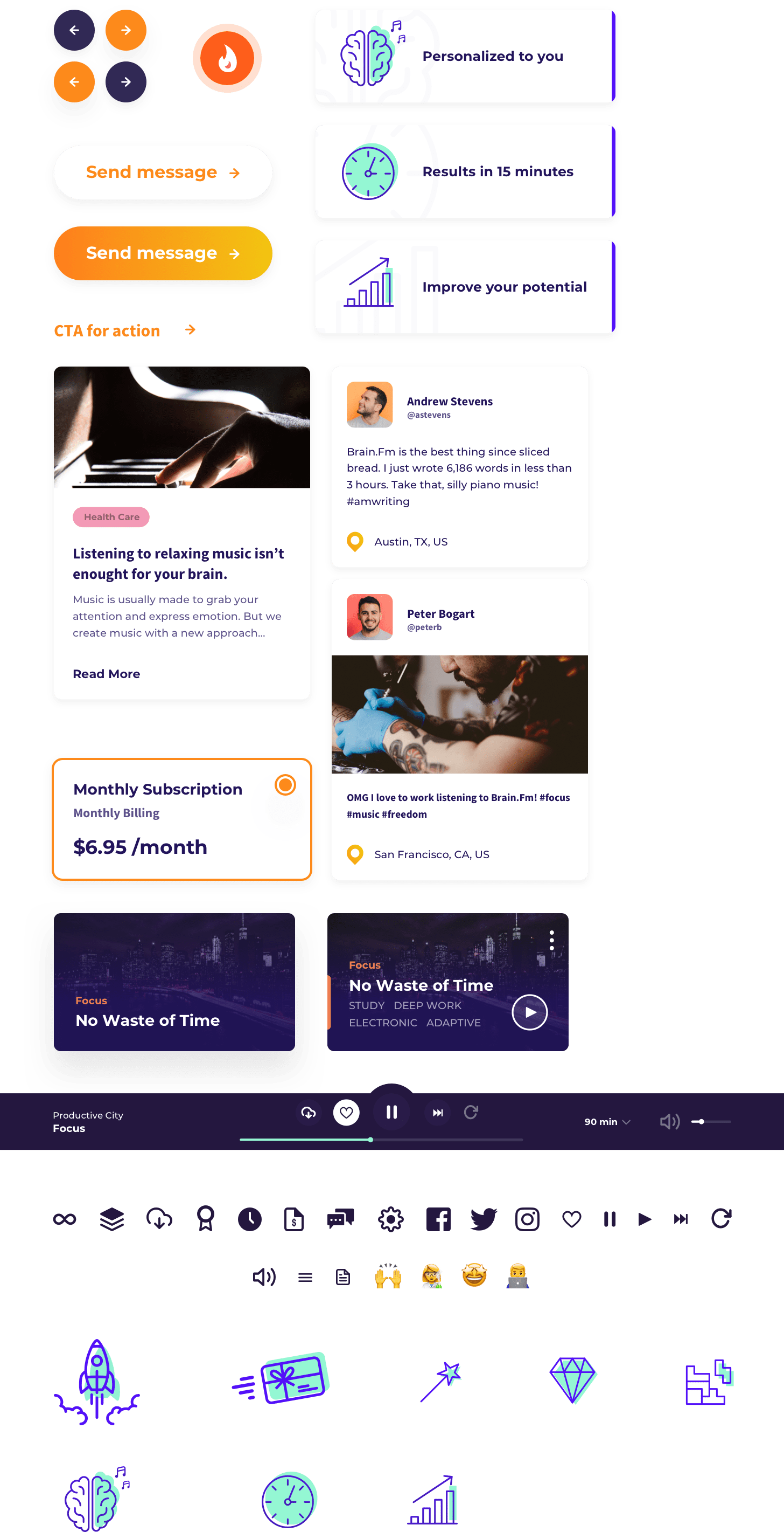
A detailed and well-documented UI Kit made the transition to the development of the new Brain.fm website and platforms seamless and efficient. In addition, we built a new MacOS desktop app that completed the 360-Brain.fm-ecosystem.

To help the Brain.fm brand grow towards developing a distinguished personality, we identified natural attributes and character traits resonating with the brand and its offering.


A thorough deep-dive into color psychology resulted in an organic visual representation of mental states and songs within the platform.
We centered the selection and matching of each color and state around the feelings and senses we wanted to convey. As for the Brain.fm brand, we chose cool colors within the blue spectrum to emit the desired sensations of serenity, calm and comfort.
Each mental state has its own color.


We started our UX journey by rearranging and optimizing all platform-specific flows. We then moved over to creating user personas to clarify user types, empathize with them and understand their user journey.
Working side-by-side with the client, we were able to leverage existing insights and research.
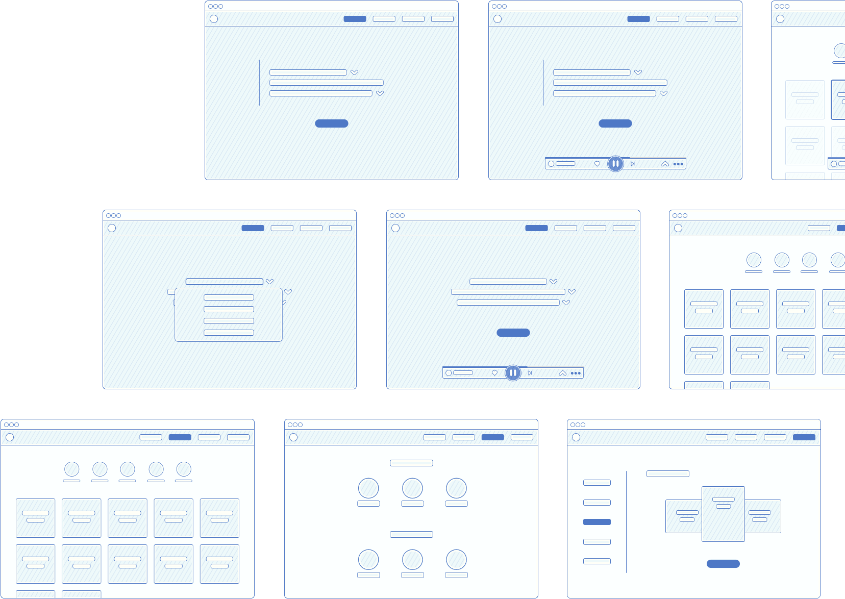
As part of the brand refinement, our objective was to make Brain.fm more human, friendly, direct, reliable and warm. One of the resources we leveraged to translate these attributes into our UX/UI was the use of natural language, resulting in a straight-forward and easily-understandable communication approach.

Last but not least, we applied our UX/UI to the entire website and platform.
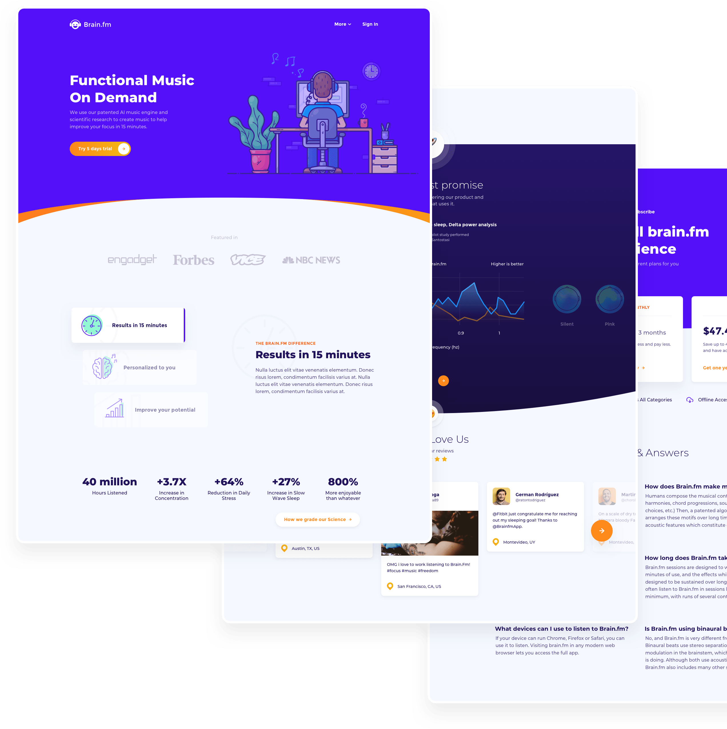
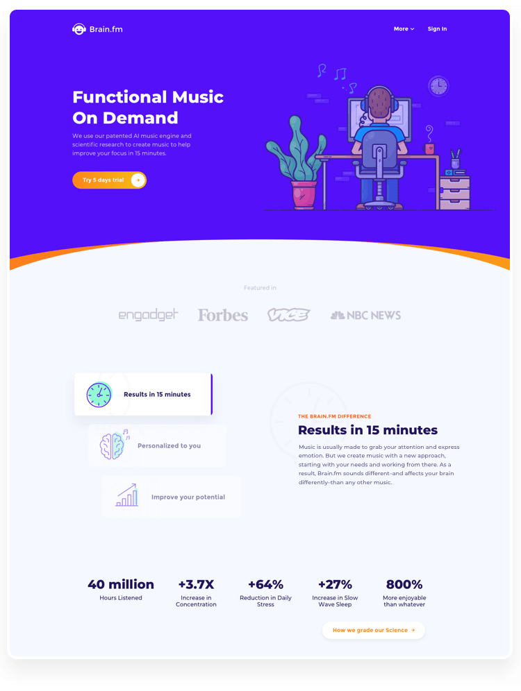
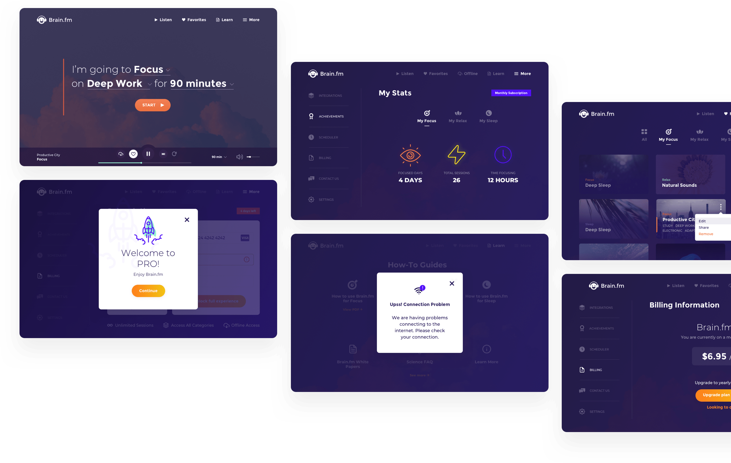
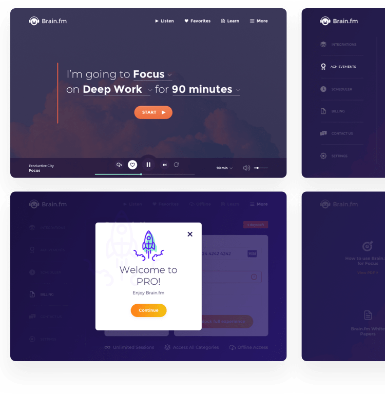


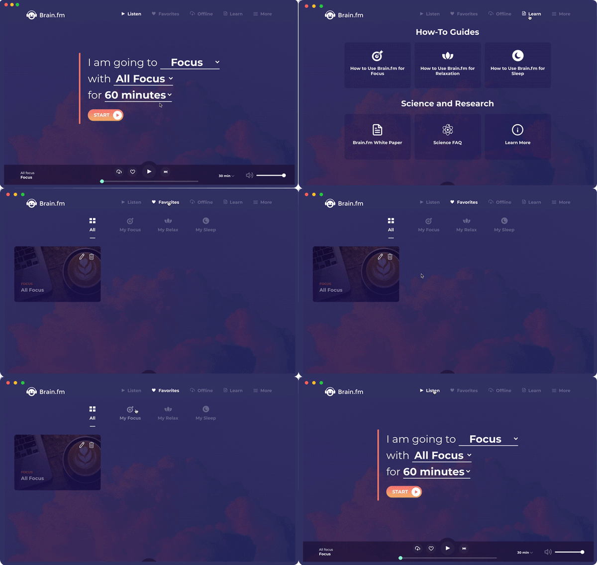
Our thorough and detailed UI KIT facilitated the transition to our development team tremendously and allowed for reusable components when applying the brand new design to the website, mobile and web app. In addition, we leveraged the existing web app to build Brain.fm’s very own MacOS desktop app from scratch in Electron JS. Highlights include touch bar functionalities, enabling an offline mode for music consumption, and a high performance level.
Case Study

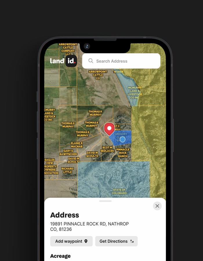
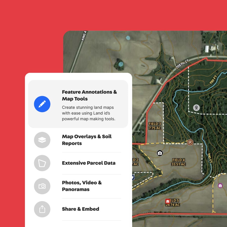
We partnered with Land id on their digital transformation, including completely redesigning their mobile application.

Case Study

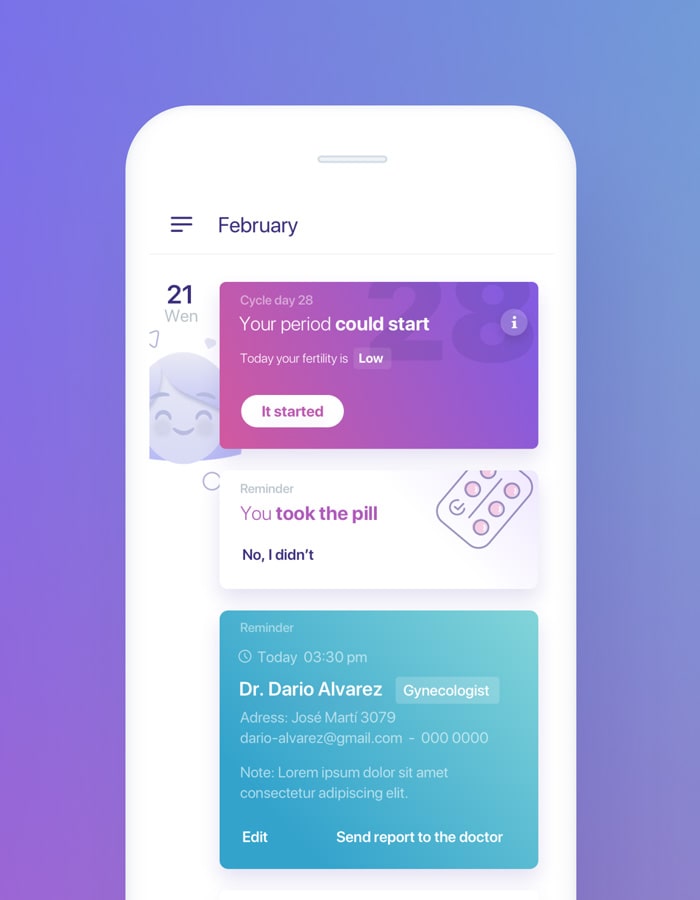
We created an integrated breast health monitoring system, featuring a mapping device, an app with advanced dynamic AI algorithms and blockchain.


Case Study

We worked together to create Shopify Ping, a mobile application for merchants to share links, offers, products descriptions, and more.


Case Study

We worked side-by-side with Vooks to design and build a highly engaging, scalable streaming platform. The AWS environment was capable of accommodating hundreds of thousands of concurrent users.


Case Study
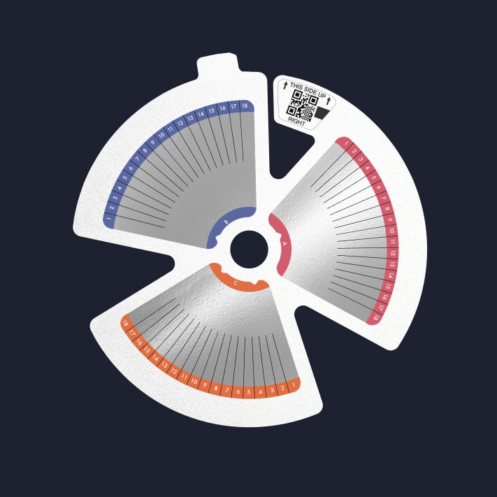
We highlight a range of case studies showing how we're using AI and computer vision technology to build innovative products that are transforming lives.

Case Study

Our work has ranged from the implementation of a new data warehouse, adoption of a new data visualization platform, to spearheading machine learning projects.

Case Study
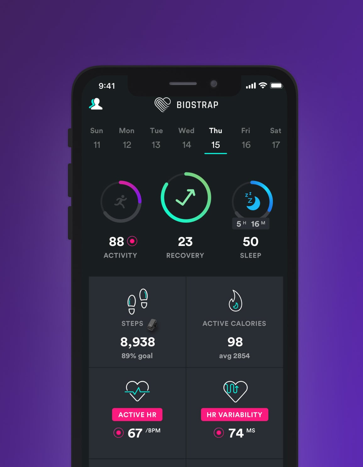
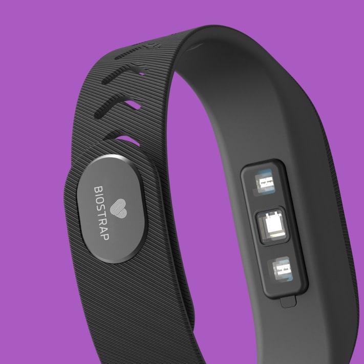
Explore a range of case studies highlighting how Qubika is pushing forward the wearable revolution, and providing specific development services to our clients.

Case Study

OneSignal's strategic alliance with Qubika led to product diversification, platform integration, and rapid growth.

Case Study

Explore how Tabula Rasa leveraged agile product management to revolutionize drug traceability, streamline processes, and achieve a rapid market launch.


Case Study

Ripple partnered with Qubika to integrate crypto exchanges, expanding their services and enhancing global reach.


Get in touch with our experts to review your idea or product, and discuss options for the best approach
Get in touchArtificial Intelligence Services
Accelerate AI
Healthcare Solutions
Data
Agentic Factory
Financial Services Technology
Platform engineering
Data Foundation
AI Blog Post