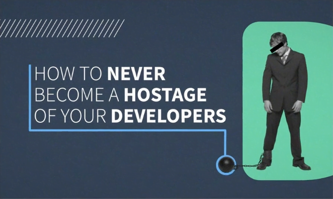


Onboarding UX: Best practices to improve app experiences
Imagine you have ordered amazing furniture pieces from Ikea. You are excited to assemble your furniture, put it into your new apartment, and throw a big housewarming party to show off your new house to your friends. But, Ikea forgot to include a self-assembly manual in your furniture boxes.
How would you feel? Confused? Frustrated? Angry?
You figured out how to assemble those pieces eventually by putting in some extra hours. But in the end, you are exhausted. What will be your feeling towards Ikea? I bet, not so great! There’s even a chance that due to this poor experience, you may not visit the store again.
Something similar happens when your app or web product doesn’t provide an intuitive user-centric onboarding experience. Users won’t want to sign up for your services. Or even if they do initially, later they might abandon the app. No word-of-mouth publicity, because users won’t refer your product/service to others. They prefer the services offered by competitors.
These are all potential results of not following the onboarding UX best practices.
If you want your users to sign up and keep coming back again and again, investing in providing the best user experience during their onboarding is a must. It’ll save your time in the long run, increase customer satisfaction and also have an impact on the ROI.
Onboarding UX will help users explore, learn and navigate through the benefits and features of your product, thus making their product journey more intuitive and rewarding.
But how to make this happen? In this ultimate user onboarding guide, you’ll learn the practical tips to implement in action as we dive deeper into the topics “Onboarding UX patterns”, and “Onboarding UX best practices.” We will also be seeing some amazing onboarding UX examples on the go.
User onboarding and its importance

In simple words, User Onboarding is product education for users. During this process, they will learn how to make the best use of your app or product for their needs.
By creating a remarkable user onboarding experience, you will not only help your business achieve greater goals, but you will also help users to get maximum return from your app with a minimum investment of their time.
Let’s talk about the main advantages of the onboarding process and its different stages,
1. Increases the conversion rate
The first time when people land on your product, they are casual visitors. Their initial interaction with your app or site will determine whether they will become returning users or not.
Well-designed onboarding UX will explain your product and its benefits to visitors before they make their purchase or sign-up decision.
2. Enhances the product adoption
Once users sign up for your product, they have a particular goal in mind, which they want to accomplish using your service. Offering an interactive onboarding guide will help them use your product comfortably and achieve their goals easier and faster.
3. Boosts the long-term retention
Acquiring new users costs more than retaining the acquired ones. Providing an engaging onboarding experience throughout the user’s product journey will build confidence in users and trust in your product.
A satisfied user is a happy user. And happy users will stay for a long time.
4. Boosts the user engagement
An interactive onboarding will engage users right from the start. Showcasing your product’s best features, benefits, and how to use them will help you increase that engagement gradually along the way.
This may not happen if you don’t have an onboarding process in place.
What are the main stages of an onboarding process?
The onboarding process is mostly divided into 4 stages.
1. Pre-onboarding stage
This is a stage where the user first-time hears about your product.
How persuasive and engaging your copy is, and how beneficial your call to action is will decide whether they will stay for what you are offering or not.
At this stage focus on,
- Writing a compelling copy to attract users (social media posts, blogs, ad campaigns, or landing pages)
- Invite them with a clear call to action
- Convey the value of your product by offering a powerful lead magnet
- Make the experience non-spammy, non-risky
2. Welcome Stage
At this second stage, users have already made their initial interaction with your product. And now it’s time to open all your cards for them. It’s time to make your users feel at home.
When a guest visits our house, we give them a house tour. Your onboarding experience UX’s responsibility is the same towards new users. To give them an introduction to your product and service.
At this stage focus on,
- Welcoming and thanking the user for choosing your product
- Giving a quick tour about how to use your product or service
- Highlighting the main benefits of your service
3. Category focused stage
Just like the name says, this stage is about educating users about the features and categories of your product in detail. Also called the training phase.
At this stage focus on,
- Introducing different features
- Providing extensive learning tools for them
- Offering real-time help if needed
4. Pro stage
At this final stage, your job is to make the user experience smooth and seamless throughout their lifetime presence on your app/website.
This is like a maintenance stage. It’ll be ongoing and progressive.
At this stage focus on,
- Keeping consistent seamless user interaction
- Resolving queries and problems with help of pre-existing UX solutions
- Making user’s experience better
Different types of onboarding UX patterns
1. First-look product tour
Use this onboarding pattern to give an initial introduction to your product and services. If done right, this will help you to set the right tone and make a lasting impression on your user.
First look tour – Hundreds of examples on Dribble
- Provides a quick and easy introduction
- Easy to build
- Gives a first impression of the product
Cons
- Often skipped by users
- Risk of being lengthy and boring
- Can feel like an interruption
Our recommendation: Don’t make the tour lengthy, to be precise, not more than 5 slides. Keep your copy minimum and add graphics to make it attractive and engaging. Add a progress bar to let the user see the tour progress and give the option to skip or exit the tour.
2. Walkthrough product tour
This is an upgrade to the first-look product tour. Walkthrough tours are dynamic. Instead of just giving text information, here you showcase how to act on that information using animation, graphics, or video.
Panic.com brilliantly showcases its services with an engaging walkthrough tour
Pros
- Achieve better results compared to a static tour
- Users are less likely to skip this
- A quick way to educate people about your features
Cons
- Too many instructions at once can lead to confusion
- If the walkthrough is too long, it could irritate users
Our recommendation: Make the walkthrough short, sweet, and simple. Avoid overwhelming the user with loads of information in a short time. Give an option to exit or replay.
3. Self segmentation pattern
“I made this only for you!” How would you feel when someone says this to you? Exactly! We love receiving tailor-made products. And this pattern does something similar.
The self-segmentation pattern allows users to select how they want to use the product. They customize the experience according to the choices the user provides.
Twitter, Pinterest, and Medium are some very popular onboarding UX examples for this pattern.
Check out Wattpad’s friendly and personalized feed for readers and writers
Pros
- A unique experience for users
- Helpful to design a better UX for the entire product
- Can increase user retention
Cons
- User needs to put in more effort compared to simple walkthroughs
- Might not be for everyone
- Can be lengthy
Our recommendation: Don’t force the user to choose and allow them to edit their choices. Always give an option to skip.
4. Tooltips
Tooltips are one of the most efficient forms of UX tactics. While walkthroughs give you the tour at the beginning, tooltips will help users throughout the product journey.
This onboarding pattern lets the user explore the product on their own and presents the information right then and there in the form of a small rectangular text box pop up over the feature.
Figma uses Tooltips to give a quick onboarding tour for their users
Pros
- Helps users throughout the product usage
- Reduces user’s cognitive efforts
- An efficient way to explain a product’s features as needed
Cons
- If they are constantly overlapping, they can lead to frustration
- Hard to keep them clear and simple
Our recommendation: Avoid too many tooltips and smaller fonts. Keep it short and simple. Give the choice to view or dismiss it.
5. Checklists
That feeling every time you get when you cross off tasks from your checklist…Priceless!
Embed a checklist in the right way and you will give your users the same sense of achievement throughout their product journey.
But what is a UX checklist? A UX checklist is an ordered list of actions a user needs to perform to accomplish a particular task. Examples include profile optimization, job application submissions, or a check-out process.
Figma uses Checklists to give a quick onboarding tour for their users
Pros
- Easy to follow
- Users feel more in control of actions
- Increases user retention
- Makes it easy to track progress
Cons
- Too many to do’s can make the user feel trapped or overwhelmed
- No progress can be stressful
- Not having a skip option can be a blocker in product adoption
Our recommendation: Keep the list of actions limited. Ask for tasks that can be achieved easily. Make the user feel good about completing actions.
6. Hotspots
Hotspots are primarily used at the beginning of the product tour. They attract user attention to a particular element in the form of blinking dots. They are helpful when you want to navigate users somewhere.
Oftentimes Hotspots are used in combination with Tooltips. Where Hotspot attracts user attention to a feature and tooltip reveals that feature’s information.
One of the best onboarding UX examples for this pattern is Figma.com‘s onboarding flow with a combination of tooltips and hotspots.

Pros
- Quickly catches the user’s attention
- Easy to follow and understand
- Helps to keep the interface minimalistic
Cons
- Too many hotspots can be confusing
- Using a hotspot to provide important information might be risky if the user doesn’t pay attention
Our recommendation: Combine hotspots with textual instructions and use them only for specific actions. Make instructions simple to follow. Avoid using hotspots to provide important information.
7. Blank Slate
This is a great way to utilize the blank space to navigate users towards the product features, quick tips, and shortcuts. You can use this pattern throughout all the onboarding stages.
Check out how brilliantly “Hemingway App” uses the blank space
Pros
- Quick help for users
- A time-saving solution
- Easy way to nudge users towards different features
Cons
- Not as easy to build as previous options
- Too many tips can be overwhelming and confusing
Our recommendation: Avoid too much clutter. Keep the interface as clean and simple as possible. Don’t overwhelm the user with information.
8. Demo content
Demo content is an upgrade to a blank slate pattern. Instead of providing tips and instructions, demo content provides a sample of actual content in context to respective features.
This makes it easy to understand how a particular feature is working and how it can be used.
For example, Notion’s platform offers a variety of templates for every feature.
Pros
- Reduces user’s cognitive efforts
- Gives the user a blueprint to follow
- Increases user retention
Cons
- Building this can be time consuming
- Creating relevant content can be a lot of work
Our recommendation: Keep the content short and easy to follow. Don’t create too many content pieces to avoid confusion. Keep your demo content easy to follow. If possible, provide templates.
How to decide which onboarding pattern you should apply?
Think about these 3 questions,
- Who is your target audience?
- What is the most suitable pattern for your Target audience?
- When should your UX pattern be applied?
Here’s an onboarding UX example for this,
Let’s say your target is a job seeker. A checklist pattern to see if the applicant has fulfilled all the requirements or not could seem like the most beneficial Onboarding UX pattern. The best time to show this up is when the user is filling in an application.
A brief dive into Rise Sleep’s onboarding
Now that we’ve showcased the different types of Onboarding UX Patterns you might be wondering how they all integrate into a completed product. In this section, we’ll take a look at the onboarding process behind sleep tracker & energy calibrator app Rise Sleep, in order to illustrate some of the main concepts we have been discussing.

To begin, this particular onboarding process starts with a round of questions. Since the apps’ objective is to improve users’ quality of sleep, it begins by mapping out a user profile with relevant information entered by the user. This initial round of questions and data collection aims to understand user objectives, characteristics and acts as a key step in the personalization and familiarization process with the app. This is why Rise Sleep begins by asking its users what are the main goals they want to achieve while using its product, all while assessing different physical characteristics (for example age, gender), traits (average quantity of hours slept every night, etc) and potential chronic diseases or conditions that should be taken into consideration while using Rise.
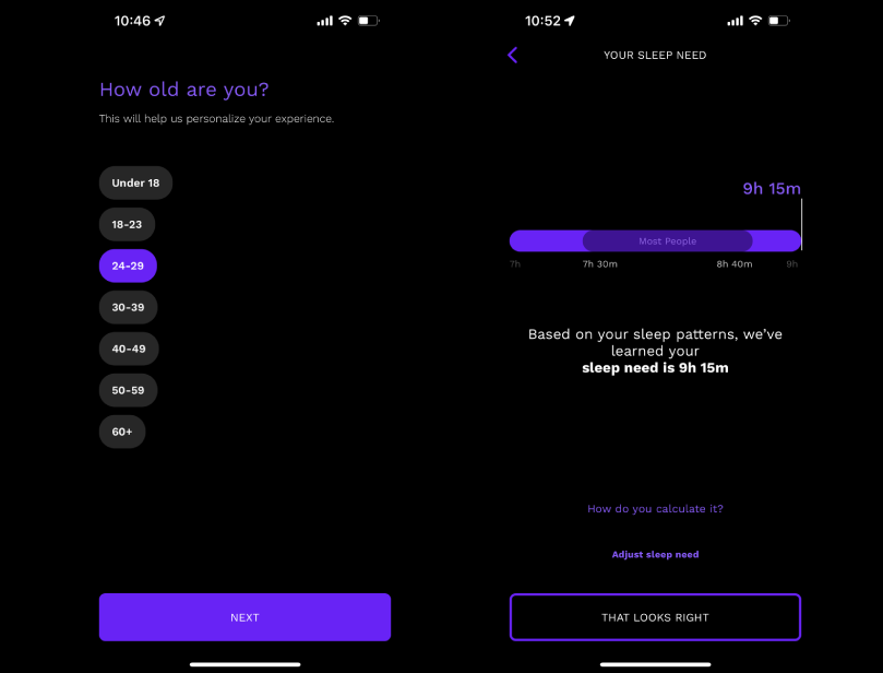
The main objective of pursuing the latter has to do with providing a UX that goes a step further in user personalization: it not only allows for an engaging experience but since the data collected is based on users’ personal accounts and characteristics, the app essentially works with data that is non-transferable and only produces results when based on user-generated data. Here’s where the value of creating this particular product and matching the onboarding process lies.
Along with the latter, another set of questions that the Rise Sleep app asks has to do with options regarding your sleep patterns, in order to recommend the user healthier habits to improve their quality of sleep. By collecting all this data during the onboarding process the app can actually begin predicting different stats, alongside begin working on its different indicators that will, later on, provide the user with accurate predictions. For example, the Rise Sleep app shows you the moments of the day you’re likely to be more productive, the hours you’ll need to sleep in order to feel well-rested, notify you when it’s time to go to bed, etc.

To conclude this section, we can say that although the onboarding process varies from product to product, the focus lies in placing user personalization on a pedestal and creating an enhanced UX. As well as the latter, these improved solutions provide users with a deeper understanding of the app’s inner workings and how predictions are calculated, thus creating a stronger relationship between user and product.
Best onboarding practices for UX success

Now there is one more important topic left to discuss. The best practices you should follow while designing your onboarding UX process.
Deliver a concise and clear experience
Yes, when you are designing an onboarding experience, your objective is clearness, not cleverness.
Make it as simple, minimal, and quick as you can. Remember, users usually don’t have as much time to grasp complex design ideas. They are reaching for your product to actually provide them a solution, not for it to create new issues or accentuate their already existing ones.
Give the user a spotlight
The hero of your onboarding UX movie is and will always be your user and not you.
Make sure your onboarding experience is talking about your users, their needs, wants, and offering solutions to solve their problems.
Don’t put a gun to their head
When you force users to take tours and sign-up for unnecessary accounts or newsletters, they feel exactly like someone is putting a gun to their head. Except the gun is not filled with bullets but with nonstop pop-ups.
Give users as much freedom as possible. Let them choose what they want to do next. Let them sit in the driver’s seat. Your job is to guide them like Google Maps.
Don’t make users overthink
Everyone is busy worrying about something. Don’t give users another over-complicated task to think about. Don’t make them wonder what to do next, or how to take the next step.
Think like a user. Analyze and research their mindset, struggles, and desires. Make your onboarding process so seamless that it’ll give them the answer to a question before it even pops up in the user’s head.
Provide success blueprints
Remember how you used to refer to your friend’s homework because that way it was easier to do? Having something to refer to makes the work easier than starting from 0.
And your users crave that too. Provide them with templates or blueprints to follow.
Think like a user. Analyze and research their mindset, struggles, and desires. Make your onboarding process so seamless that it’ll give them the answer to a question before it even pops up in the user’s head.
Onboarding UX 2.0: An extended take on UX best practices for apps in the wearable device ecosystem
If it weren’t already enough of a challenge to strategize around UX Onboarding for regular mobile apps, it gets even more complex when your mobile app has a dual function as a so-called companion app. In these cases, the mobile app is the gateway to a physical smart product or wearable within the wearable/smart device ecosystem.
The onboarding responsibility for companion apps is slightly different and responds to additional best practices to follow for this ecosystem,
- When someone purchases a wearable device, the first thing they do is enable and set up the device. A companion app plays a big role here. Being the first touchpoint with the device, it is an app’s responsibility to make the user feel confident and assured in taking their first steps.
- Anticipate the queries and issues users might face and provide ready-to-access solutions they need to get started without being overwhelmed.
- Also, easy access to the technical support team to troubleshoot the problems they might encounter during device pairing and connectivity will reflect the brand adequately, making the overall onboarding experience assuring and hence, putting the user at ease.
- Oftentimes users tend to shun apps that exhaust too much battery or take a longer time to load the data. Make sure your companion app is fast and light; providing a frictionless experience to the user.
- Maintain the regular updates for bug fixes and introduce new features to keep the user experience seamless throughout the app journey.
User onboarding in 2022: the latest trends
As the digital world started expanding, companies shifted from product-centric to user-centric design. The goal was simple: create an experience that is consistent with the user’s needs.
Let’s discuss some of these latest trends in user onboarding that make people go from “Oh no, another signup!” To “Wow! I want this!!”
1. Minimalism
Would you prefer to cook a recipe with 5 ingredients or 25 ingredients? The more ingredients you add, the more complicated and overwhelming the recipe will be: so does the clutter of copy, images, videos, pop-ups, and ads.
A simple, clean, and clutter-free onboarding experience will never go out of style. Alongside being timeless, minimalistic onboarding experiences especially captivate new users who aren’t willing to spend a lot of time trying to understand your product…
2. Personalization
Nowadays, getting a deep understanding of your target user’s different personalities and profiles is key to creating a product that will not only grow over time but be potentially successful. Getting to anticipate users’ needs before they even think about it is what all the major tech giants are all about. From Netflix’s top movie picks based on what you’ve been previously watching to Twitter’s algorithm that highlights tweets from your favorite celebrities, predicting one’s likes and user personalization is currently taking over all of our most-used apps – and it’s a feature we’re getting more and more comfortable with. Users expect and demand personalization from your product.
3. Social Networking
It is a fact that users have less time to fill out long signup forms. They would much rather exit than spend more than 3 minutes filling up a long list with contact information. This is a major reason why social media integration shouldn’t be absent in your product – just by including the one-click sign-up in your login screen you will most likely get a drastic increase in user acquisition.
Final thoughts
There will always be new and emerging trends, and technologies. And, there will always be room to improve your product and provide a better UX onboarding experience.
The best way to handle the onboarding process is to always keep the user’s best interest in mind, by simplifying processes, screens and constantly upgrading features to provide an engaging user interface and experience.
Last, but not least, as the digital space is constantly evolving, so should your product. Leverage UX research to:
- Learn from users what kind of onboarding process would be helpful for them in the first place
- Understand how your current onboarding process works by leveraging analytics (quantitative insights) and user interviews (qualitative insights)
- Iterate as needed and measure the results!
Learn more about Qubika’s Product Design Studio.
Frequently asked questions about onboarding UX
What is onboarding UX?
Onboarding UX refers to the design and implementation of user experiences that guide new users through a product or service, helping them understand its features and benefits. Effective onboarding UX aims to reduce friction, enhance user satisfaction, and increase the likelihood of continued engagement.
Why is user onboarding important?
User onboarding is crucial because it sets the tone for the user’s relationship with the product. A well-designed onboarding process can improve user retention, reduce churn, and encourage users to explore and utilize more features, ultimately leading to increased value for both the user and the business.
How does onboarding UX differ for companion apps in the wearable device ecosystem?
For companion apps linked to wearable devices, onboarding UX must address additional considerations:
- Device pairing guidance. Clearly instruct users on how to connect their wearable device to the app.
- Real-time feedback. Provide immediate responses to user actions to confirm successful setup or highlight issues.
- Support accessibility. Offer easy access to customer support for troubleshooting device connectivity or functionality problems.
- Resource efficiency. Design the app to be lightweight and energy-efficient to preserve device battery life.